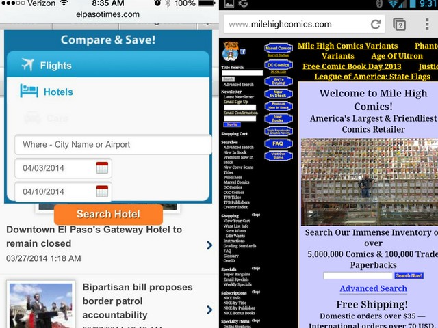
Gone are the days where your business can scrape by without including an optimized mobile website as one of your key tourism marketing strategies. With over 60% of people searching the web from their mobile device, if your website is not mobile-friendly, then that means you’re not providing a positive user experience for the majority of potential prospects.
While most businesses design websites for desktop computers first, your tourism business can get ahead of the competition by prioritizing mobile website design.
In fact, Google recently released an update to their algorithm that prioritizes content optimized for mobile above all else. In other words, Google will rank its search listings based on the mobile version of content—even if the person is searching from a desktop computer.
If you’re ready to take action on the most important mobile website design trends, then try these suggestions for creating a perfectly optimized tourism website:


3 Mobile Website Design Tips To Implement In Your Tourism Marketing Strategy:

1. Optimize For Speed
If your mobile website isn’t optimized for speed, you run the risk of losing potential guests struck by boredom as they wait for your website to load. Believe it or not, 61% of users won’t return to a mobile site they had trouble accessing— and 40% of them will end up visiting a competitor’s site instead. (MicKinsey & Company). What’s more, according to KISSmetrics, 40% of people abandon a website that takes more than 3 seconds to load. Mobile devices typically can’t handle heavy images and video like a desktop can. That doesn’t mean you can’t use photos and video, but that you will need to ensure they are crunched, optimized and responsive so they don’t dramatically slow down your site. It’s important to also remember that Google uses speed as a determinate for how well sites will rank. If you want to improve your visibility in Google, then you’ll want to ensure your mobile site is quick and efficient. We recommend using GTMetrics to see how well your mobile site scores and then following the recommended steps to improve your performance. Alternatively, our team can always help provide insight and action steps.Pro Tip:
While desktop users may be ready to sit down and learn everything there is to know about your tour or hotel, most mobile users are not. You can customize your mobile design to use only the copy that is absolutely necessary for customers to get a feel for your business and book straight away. For example, they may already be in your area and are looking for something to do that afternoon or a hotel for that night.
2. Optimize For Usability
It sounds like a given, but you’d be surprised at how many mobile websites just aren’t that user-friendly. Usability encompasses speed, simplicity of design and readability of content. Make sure the most crucial content is easy to find. If users have to go searching your site for what they need, chances are, they’ll give up. In fact, 88% of users who searched for a local business on a mobile device called or went to that business within 24 hours. (Nectafy) If someone is searching for your business from their phone, that means you’re on their mind—and they’re ready to take action. Take advantage of this and ensure that your contact information is easily and readily available. What’s more, we always recommend asking for feedback on your mobile tourism website from someone not familiar with what you do. If it takes them longer than a few seconds to quickly understand what you’re all about, then you need to make some changes.Pro Tip:
There’s nothing worse than scrolling down a page on mobile device and then hitting an interactive section like a Google Map or having a popover that takes up the whole screen that you can’t escape. For example, if you have Google Maps embedded on your mobile site and it takes up the whole screen, users will only be able to move the map, not scroll down the webpage (essentially leaving them trapped.) The same goes for popups. Ensure that your escape or exit button is inside the screen so users can easily opt out and not be forced with the option of providing their email or leaving the site—because they will choose to leave the site almost every time.
3. Optimize For Responsive Design
It is common practice for users to access your website across multiple platforms. Make sure your design maintains the same look and feel no matter where your customers are located. While you can design a specific site for your mobile device, it’s crucial that your brand remains consistent across all platforms. This is where responsive design comes it. When you build a responsive tourism website, this means that your website will automatically adjust the way it looks depending on the size of the screen. For example, a small, fast loading image will be chosen for mobile and tablet views, while a larger resolution will be displayed on desktop and laptop screens. Most website themes today are responsive, though typically they require a bit of advanced coding to ensure they look and function 100% correctly. The easiest way to know if your website is responsive is to plug it into Google’s Mobile Friendly Checker. You can also drag the lower righthand corner of your browser to see how your website looks in different sizes. Mobile Test Me also lets you test your site on a variety of mobile devices so you can see what it would be like to walk through your site as a user. Google’s Test My Site lets you see hhow your mobile site measures up in mobile friendliness, mobile speed, and desktop speed; it even sends you a free report on what your website could improve upon.

